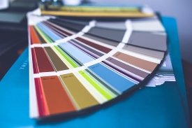
Choosing Display Design Colors

The exhibit display design colors you use are significant to your branding and sales effectiveness on the exhibition floor. Exhibit colors should always be consistent with your logo and company colors to reinforce your message and overall image.
In fact, the colors you use in everything you do from product packaging, website development, and social media accounts to email templates, videos and marketing materials should be consistent to optimize marketing performance.
Color evokes emotion, association and attitude about your
company and the products you sell. The role of color is essential, based on research
by digital marketing firm Marketo that reveals color can help drive 60 to 80
percent of consumer decisions.
While individuals respond to color differently, studies show
consistent patterns that exhibitors – and all sales and marketing professionals
– should be mindful of for successful branding and sales effectiveness.
Color is also relevant based on industry category, according to Carianne King of Social Media Today. Some industries are associated with warm colors like red, orange, black and yellow. Others are associated with cool colors like blue, green, purple and brown.
Colors evoke the following marketing messages and images.
Warm Colors
- Orange connotes excitement, vitality and exuberance. The color is typically a good match for healthcare
and technology organizations.
- Yellow represents positivity, motivation and creativity in the minds of consumers. It is a popular choice for the food industry and companies specializing in energy and household-related products.
- Red by nature is a high-energy, passionate color that grabs attention. It can be viewed as aggressive and provocative, as well. Red is often used among automobile, technology, food and agricultural companies.
- Black reflects prestige and sophistication. Black and dark gray tones are often used for high-end products and services. Industries in the clothing, technology and transportation businesses are well suited to use black and shades of black in their logos and design.
Cool Colors
- Green in the darker hues delivers a message of affluence and prestige. Lighter green tones reflect serenity, health, and freshness. The color is well suited to be used for brands in the energy, finance, food, and housing industries.
- Blue stands for trust and security. It evokes calmness, as well. It is popular in the agriculture, healthcare, airline, technology, energy and finance industries.
- Purple stands for royalty, elegance, and spirituality. Companies in finance, technology and healthcare often use the color for branding purposes.
- Brown is used to reflect natural, strong and durable products. It is a popular color with agriculture, clothing and car companies.
Which colors do companies feature in their logos and marketing most often? A study among the top 100 brands reveals the following.
- 33% - Blue
- 29% - Red
- 28% - Gray or Black
- 13% - Yellow or Gold
For more information on high-impact trade show booth color and display design, click here: Trade Show Booth Design.
Sources: Entrepreneur, Inc. Logo Design Works and The Logo Factory.
Related Information - Display Design
Five Fundamentals to Magnetic Booth Design
Trade Show Booth Graphic
Effective Trade Show Exhibit Design Strategies
3 Questions to Ask Before Starting Your Booth Design
Create Winning Graphics for Your Exhibit
How to Create Show-Stopping Graphic Design
Keys to Effective Booth Design
Design Tips for Your Exhibit Display
Tips for Effective Trade Show Graphics
How to Create an Eye-Catching Exhibition Stand
Graphic Design "Boot Camp" Tips for Event Marketers
Share Success Tips Do you have a great exhibiting or marketing tip that enhanced
your trade show results? Share it here! |


